

Quick answer
If an onlyfans app layout treats the feed as the whole product, it misses the screens that drive payment. The page below breaks the interface into creator, fan, and admin views, then shows what each screen must do to move a user from preview to subscribe, tip, or paid message. Use it as a layout map, not a feature dump: what sits above the fold, what stays locked, and where the billing rules must be visible.
For neutral context, this guide cross-checks the topic against Creator economy and Goldman Sachs Research's creator economy outlook. So the recommendation is grounded in external market signals rather than only product claims.
If you are planning an OnlyFans-style platform, start with the interface, not the feature list. The same subscription product can feel clear or confusing depending on where the price sits, how previews are shown, and whether the inbox looks like chat or like a payment surface. That is why this guide focuses on screen logic: creator profile, fan feed, paywall, wallet, inbox, and admin control. It is the difference between a page that explains itself and a page that makes people guess.
The best layout does one job per surface. Creator pages convert; fan feeds bring people back; inboxes carry monetized messages; wallets show money state; admin panels handle moderation and payouts. If those jobs collapse into one dashboard, the user has to decode the product before they can use it. For a practical design baseline, keep the layout aligned with mobile scanning patterns such as those described by Nielsen Norman Group on mobile-first design, then adapt it to the monetization rules of your niche.
Why the OnlyFans app layout breaks first at the handoff
Most layouts fail at the moment curiosity should become payment. A fan lands on a creator page, sees a few images, and then has to guess whether the next action is subscribe, tip, message, or leave. That guesswork costs paid starts. On the same traffic, a confusing profile can easily leak the first wave of conversions before the user ever reaches checkout.
The screen should answer one question at a time. First, who is this creator? Next, what can I see for free? After that, what unlocks after payment? Teams that build the page this way usually separate discovery from monetization instead of stacking them in a single feed. Solutions such as Scrile Connect work better when the next paid step is visible without turning every surface into a sales wall.
That is also why the creator profile matters more than the home feed in this product class. The profile is where trust, price, and content depth meet. If the page is cluttered, the user has to reconstruct the offer from fragments. In practice, that means slower decisions, more abandoned visits, and a support inbox full of “is this included?” questions.
Why the creator profile cannot carry every task
When subscription, PPV, chat, tips, and live access all sit in the same block, the page starts competing with itself. Support teams then see the same pattern: users ask whether a locked post is included in the subscription or billed separately. That kind of confusion usually adds extra tickets and slows checkout decisions because the offer is not readable at a glance.
Keep the profile focused on decision-making. The feed can show activity. The inbox can handle interaction. The wallet can handle payment state. Once those jobs are split, the page stops feeling like a pile of buttons and starts behaving like a purchase path.
| Layout surface | Primary job | What must be visible | What breaks if it is missing |
|---|---|---|---|
| Creator profile | Convert interest into subscription or PPV | Preview media, price, bio, locked state, follow button | User cannot tell what is free and what is paid |
| Fan feed | Drive repeat visits | Fresh posts, teasers, stories, creator status | Return traffic drops because the feed feels static |
| Inbox | Turn chat into revenue | Message composer, billing notice, paid reply state | Users message without seeing cost or response rules |
| Wallet | Clarify payment status | Balance, payouts, purchase history, failed payments | Creators cannot see where money is stuck |
| Admin panel | Keep the platform controlled | Reports, user flags, age checks, payout reviews | Moderation becomes manual and slow |
Trigger: what opens the fan’s first screen in an OnlyFans app layout
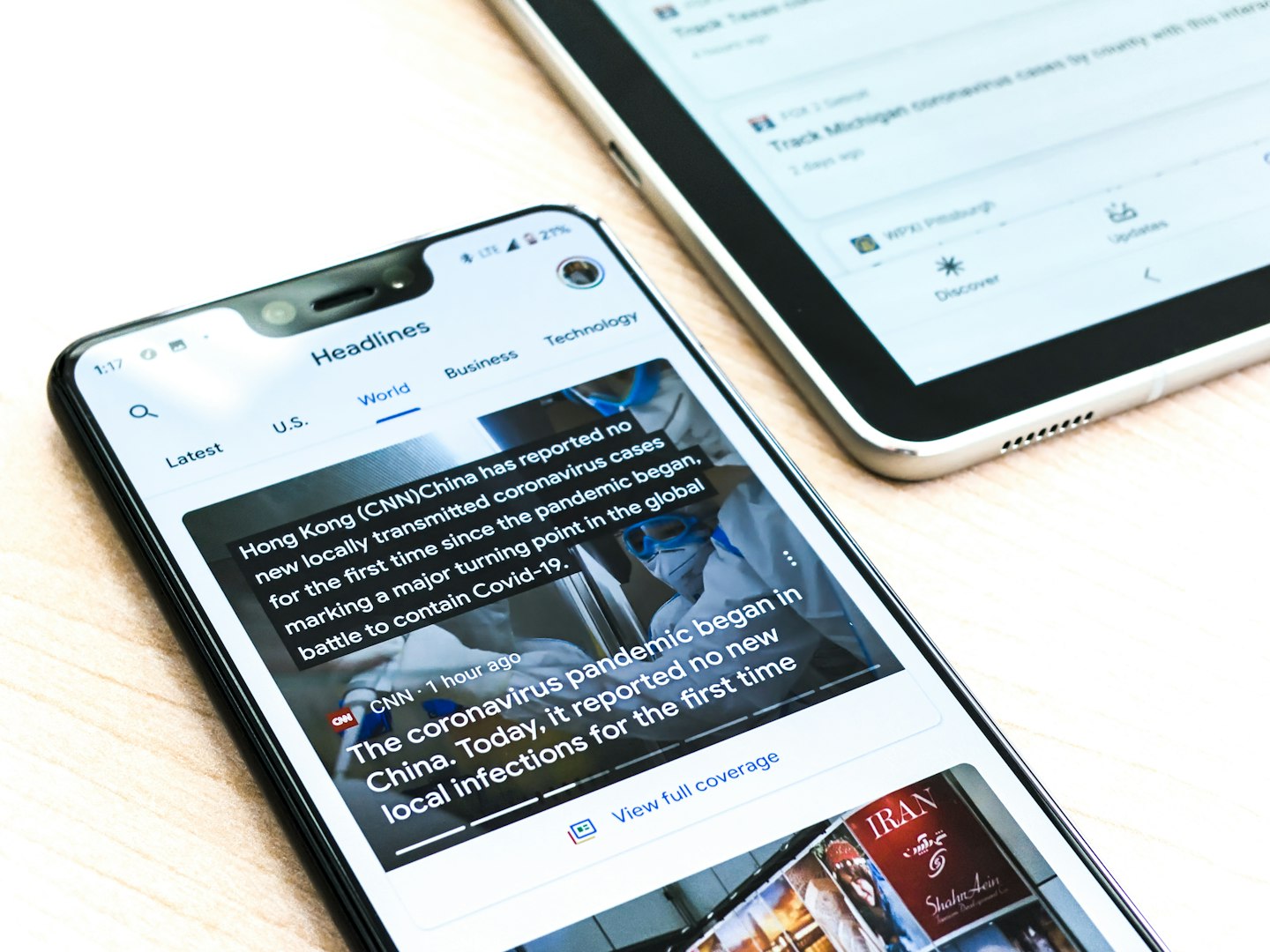
The trigger screen is the first test. A fan taps a creator profile, lands on the page, and decides in a few seconds whether the creator feels worth paying for. Healthy layouts put one clear promise at the top: a face, a price, a short bio, and one preview that shows the content style without giving away the full value. That is the part that has to work before the user scrolls.
On mobile, the trigger is even tighter. There is no room for a long welcome banner or a deep menu. The top of the page has to act as a pitch, a preview, and a trust check at once. When that fails, users bounce before the first scroll. If you want a design cue for how people scan small screens, Nielsen Norman Group’s mobile work is more useful than any generic “app design trends” article.
Above the fold on creator profiles
Put the creator name, price, follow or subscribe action, and one preview strip above the fold. Keep the bio short. The user should not have to scroll to understand whether the page is adult, SFW, premium education, or niche community content. That clarity matters because the same platform may serve coaches, journalists, and adult creators, and each audience reads the page differently.
For agencies or multi-creator brands, the same rule applies with one extra layer: make the identity of the active creator obvious before the price. Otherwise profile switches create the feeling of a broken page, not a content catalog. This is also where OnlyFans clone app development: features and cost becomes the next logical read if the team has already fixed the screen map and now needs to connect it to the build scope.
What the paywall should reveal before payment
A paywall that hides everything is too blunt. A paywall that reveals too much kills the sale. The middle ground is a short teaser, a content count, and the next action. In practice, that means preview media, a sample caption, and a clear explanation of what unlocks after subscription or PPV.
If the layout supports bundles, free trials, or discount codes, those need to sit near the price, not buried in settings. Buyers do not hunt for incentives. They respond when the offer is visible at the exact moment they decide. That is also where you can avoid a common support problem: people trying to reverse engineer the purchase path from a locked tile.
Action: what the creator and fan do on each screen
Each surface should do one thing. The creator posts, schedules, locks, or answers. The fan subscribes, tips, messages, or unlocks. When both sides share the same controls, the product starts to feel like a dashboard that forgot who it serves.
That confusion has a cost. Teams often see more abandoned actions when the same button means different things in different places. A fan should never wonder whether “send” in the inbox will cost money. A creator should never wonder whether “lock” means subscription-only or PPV-only. Put the rule next to the action and keep the label plain.
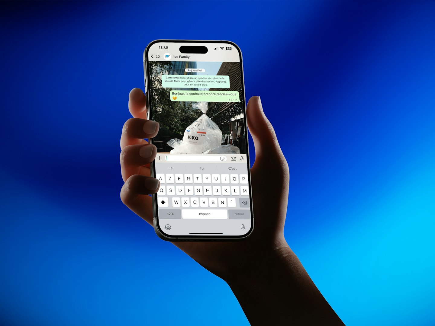
Fan inbox and billing touchpoints
Messaging is not just chat. It is a payment surface. That means the inbox needs a visible billing cue before the user types, not after the message is sent. If a reply is paid, the composer should say so. If the creator charges by time, show the timer. If the message is PPV, make the unlock state obvious.
This is where many layouts slip. They make the inbox feel like a generic messenger, then bolt monetization onto the send action. The result is charge surprise and more refund requests. A cleaner pattern is to show cost state before composition so the user chooses with eyes open.
Creator dashboard versus fan layout
The creator dashboard needs operational controls: publish, schedule, lock, refund, reply, and review earnings. The fan view needs confidence, freshness, and a clear next step. Those are not the same interface goals. If the creator dashboard leaks into the fan layout, the product becomes efficient for the owner and confusing for the buyer.
Keep the creator tools out of the public path. A creator can tolerate a dense dashboard. A fan usually cannot. The fan wants to move in under a minute, not decode the platform. That separation is especially important when the app is serving more than one niche at once, because the public layout must stay simple even if the back office is complex.
| Role | Healthy layout signal | Broken layout signal | Business cost |
|---|---|---|---|
| Creator | Can publish and price content in one place | Has to jump across 3 screens to lock a post | Posting slows down by 2-4 minutes per item |
| Fan | Sees preview, price, and next action immediately | Has to scroll past settings and banners | More drop-off before first payment |
| Moderator | Can review reports and verify identity quickly | Must search across user, post, and payout screens | Queue time grows from hours to days |

Follow-up, log, measure: what keeps the layout profitable after launch
Once the screen is live, the layout should produce signals, not just traffic. Follow-up means the user gets nudged back into the product with new posts, creator activity, and saved creators. Log means the platform records purchases, message payments, unlocks, and failed transactions. Measure means the team can see which surfaces create revenue and which ones just consume attention.
If those three steps do not exist, the app becomes hard to improve. A creator may feel busy, but the business still leaks value. Usually the leak sits in paid messages, low conversion on preview cards, or weak return visits after the first unlock. That is how a layout misses its own economics.
What to log in the admin panel
Log the obvious events first: subscription starts, renewals, PPV purchases, tips, message charges, payout requests, content reports, and failed payments. These are the numbers that show whether the layout is doing its job. When you can trace them to a specific screen, you can fix the exact surface instead of redesigning the whole product.
Teams that skip this step end up arguing from opinions. Teams that keep a clean log see the pattern faster: a weak preview tile, a confusing price badge, or an inbox entry point that never converts. The operational win is simple. You move from guesswork to page-level decisions. For platform-side policy work, it also helps to review security and governance guidance from a standards source such as NIST. Especially if the admin surface handles identity checks, access control, and payout holds.
| Trigger | Owner | SLA | Output |
|---|---|---|---|
| Fan opens creator profile | Frontend + product | Under 2 seconds load time | Preview, price, and subscribe action visible |
| Fan sends a paid message | Messaging service | Immediate billing confirmation | Charge state shown before send |
| Creator locks a post | Creator dashboard | One action, no page switch | Locked content and teaser saved together |
| User reports content | Moderation queue | Review in same business day | Flag, note, and decision stored |
| Payout is requested | Finance/admin | Visible status within 24 hours | Pending, approved, or held state |
Where the layout needs to change for mobile, moderation, and scale
Mobile changes everything. Bottom navigation beats deep side menus. Large tap targets beat dense cards. Sticky subscribe and tip actions beat hidden CTAs. On small screens, the layout cannot ask users to hunt for the main action. If it does, they leave before the page has a chance to explain itself.
Moderation changes the hidden half of the system. Age verification, report review, payout holds, and content takedowns need their own path. Teams often discover this only after launch, when the admin panel is already overloaded. A clean control surface keeps the public layout light and the back office usable. It also keeps support from turning into an ad hoc moderation team.
Scale changes the economics. What works for five creators can break at fifty, and what works for fifty can choke at five hundred if every screen is crowded with custom rules. Scrile Connect fits that middle zone when the goal is to launch under your own domain, keep payouts under control, and avoid rebuilding the same monetization blocks from scratch. Different story for teams that only want a lightweight content page with no billing logic.
Mobile-first constraints that change navigation
Use one primary action per screen. Keep secondary actions in a sheet, not in the header. Put wallet status and unread messages in the bottom bar only if they are truly frequent. Otherwise the layout starts to feel like a finance app pretending to be a creator platform.
This is also where the fan experience and creator experience diverge hardest. A creator can handle three more taps. A fan often cannot. On mobile, the cleanest pages are usually the ones that remove decisions, not add them. If the team tries to copy the desktop structure unchanged, the app will look complete and still underperform.
When the standard OnlyFans app layout does not fit
Not every platform needs the same screen order. A coaching platform may work better with a class-first layout. A paid community may need topic navigation before creator identity. A multi-creator agency often needs roster filtering before the profile page. The wrong template wastes attention by forcing one order on every niche.
Use the standard layout only when paid access depends on the creator relationship. If the product sells expertise, group access, or mixed content types, start from the monetization rule and adjust navigation around it. That small decision can save weeks of rework later, especially when the product team tries to reuse a generic “clone app” template that was built for a different buyer journey.
If you need the broader build logic after the screen map is clear, the next step is usually the cluster piece on OnlyFans clone app development: features and cost. It connects the layout to the build decisions and shows which parts are worth custom work.
Pick a layout path before the team starts designing
Choose one creator type and one payment path first. Do not launch with every monetization mechanism visible at once. A profile-first flow with a clear preview, one subscribe action, and one paid message path is enough to test whether the layout converts in the first 30 days. If that path works, add bundles, live access, or tips later.
Review the first 20 sessions by hand. Check where the user hesitated, where the preview failed, and which action they ignored. Then cut the clutter. A platform like this gets stronger when the page teaches you what to remove, not when it keeps every idea from the kickoff deck.
Before launch, align commercial logic with screen logic. If the layout asks for a subscription, the price must be obvious. If the layout invites messaging, the billing rule must be visible. If the layout includes moderation, the admin path must already exist. That is the shortest route from concept to a page that behaves like a product.
Why teams settle on Scrile Connect for this
For a layout-led OnlyFans-style platform, Scrile Connect matters because it already matches the parts that usually cause rework: branded profiles, subscriptions, tips, pay-per-view, private messages, live streams, video calls, and a separate admin layer for users, payouts, and analytics. That makes it easier to keep the public layout clean while the monetization logic stays inside the system instead of being stitched on later.
The practical difference is ownership. Teams can launch under their own domain, control branding and pricing, accept payments through cards, crypto, and gateways, and keep moderation and age-verification rules inside one platform. That combination is useful when the interface has to serve more than one niche, because the layout can stay consistent while the business rules change underneath it. It also keeps the same core stack useful for agencies, adult or SFW creator businesses, coaches, educators, and paid communities without rebuilding the payment path each time.
That is why this product tends to fit founders, agencies, and operators who care about the screen map as much as the business model. If the goal is a branded monetization site that goes live quickly, keeps payout control, and gives the team room to scale beyond a single creator page, Scrile Connect is usually the more direct route than assembling the same blocks from scratch.
Frequently asked questions
What if the creator profile has too many monetization options above the fold?
The page starts to compete with itself. Keep one primary action, one secondary action, and one preview. Anything more usually pushes the user into hesitation instead of payment.
When does a feed-first layout work better than a profile-first layout?
Feed-first works when repeat viewing matters more than one-time discovery, such as a paid community or a high-volume creator with frequent posts. For direct conversion, profile-first is usually cleaner because it answers price and value faster.
What risk appears if messaging and billing live in the same entry point?
Users can send messages without understanding the charge state. That often shows up as refund requests, charge confusion, and lower trust in the inbox.
How do you know the layout is hurting conversion instead of content quality?
Check whether previews get views but the subscribe or unlock action stays flat. If people reach the profile and still do nothing, the layout is likely blocking the decision, not the content itself.
When should the admin surface be split from the creator dashboard?
Split it once moderation, payouts, and verification start taking real time. If support or finance has to use the same interface as creators, the dashboard gets noisy fast.
What happens if the app is mobile-first but the desktop layout is copied unchanged?
The controls become too dense and the main action gets buried. On mobile, that usually means slower taps, more bounces, and fewer paid starts.
Builds SaaS platforms for content creators, agencies, and entrepreneurs. Writes about the business mechanics behind creator-economy products and how custom software actually ships.