

A consultant without a strong online presence in 2026 might as well be invisible. Potential clients don’t flip through directories anymore—they type a name or a service into a search bar, click, and make judgments in seconds. The best consulting websites are built with this reality in mind. They don’t only inform, they convince.
What counts as consulting today is broader than ever. Finance advisors and IT specialists share space with nutrition coaches, HR mentors, branding experts, and even adult industry consultants who guide creators and entrepreneurs on strategy, compliance, and monetization. All of them need a site that reflects credibility, clarity, and personality.
A great consulting website doesn’t shout; it guides. It makes it easy to understand who you are, what you offer, and how to take the next step—whether that’s booking a session, joining a newsletter, or exploring case studies. The design, the copy, and the tools behind the scenes all shape the impression a visitor takes away.
In this article we’ll explore standout consulting sites, break down the design choices that make them effective, and show how you can apply those same principles to your own project.
Why Website Design Matters for Consultants

Think about the last time you searched for a professional online. You probably clicked, looked around for a few seconds, and made up your mind fast. That’s exactly how people judge consultants. A site that feels clumsy or vague sends them away. A site that feels clear and trustworthy? That’s when they stay.
For many solo consultants, the website isn’t just decoration—it’s the business itself. A wellness coach might sell sessions directly through it. An HR consultant could use it as a calendar for bookings. Someone in the adult industry might rely on it to show they’re professional, safe, and easy to reach. In all these cases, the website is part storefront, part résumé, part handshake.
The best websites for consultants all have one thing in common: they lower the barrier between curiosity and action. That doesn’t mean flashy graphics or endless text. It means a design that answers the unspoken questions a visitor always has: “Can I trust this person? Do they know their stuff? How do I talk to them?”
For consulting, coaching, and expert services, this isn’t just about “looking good.” In trust-heavy fields, your website is the first serious proof that you’re worth listening to. As one digital agency working with professional services firms puts it in a recent insight on online credibility from Itineris:
“Reputation is built on credibility, and today, credibility begins online.”
— Harry Hammett, Itineris
That’s exactly what the best consulting websites do: they turn a few seconds of browsing into a clear signal that you’re competent, serious, and ready to solve real problems.
Key Client Expectations in Consulting Websites
Here’s what clients actually notice when they land on a page:
- The site loads quickly, and it looks good on a phone.
- There’s a small lock icon in the browser—proof the connection is secure.
- Real names, faces, or testimonials show up instead of vague promises.
- There’s a button that makes it obvious how to book, call, or send a message.
None of this is glamorous, but it works. When those basics are missing, visitors feel uneasy. When they’re in place, the site fades into the background and lets the consultant’s expertise take the spotlight.
Characteristics of the Best Consulting Websites

When you start browsing consulting sites, patterns emerge. The ones that leave a strong impression usually feel personal without losing professionalism. A clean logo, a color palette that doesn’t fight with the content, and photos that actually look like the real person behind the business—these small touches make it easier to trust what’s being offered. Visitors want to see a face and a story, not just stock images and vague promises.
Another defining trait is clarity right at the top of the page. The strongest sites don’t bury their pitch halfway down. Instead, they put their value proposition “above the fold,” where anyone arriving can immediately understand the service. Think of a single line that answers: Who are you, and why should someone listen? That opening moment sets the stage for everything else.
Good design isn’t just about looking sharp—it’s about helping visitors act. Booking calendars that sync with popular tools, quick chat options, and secure payment buttons all add momentum. When a potential client feels the site guiding them step by step, the barrier between interest and commitment gets thinner.
Design choices aren’t just aesthetics; they quietly decide whether visitors see you as credible or forgettable. Recent research summarized by Midas Touch Infotech shows just how much people lean on design when judging a business.
“68% of users are judging your business based on your web design.”
— Midas Touch Infotech
When you pair that statistic with clear copy and strong calls to action, it becomes obvious why polished consulting websites outperform generic templates: they look trustworthy and make the next step effortless.
Features That Convert Visitors into Clients
Look through real consulting website examples and you’ll notice a consistent toolkit:
- Interactive elements: calculators to estimate costs, short quizzes to define a problem, or downloadable guides that prove expertise before money changes hands.
- Evidence of results: clear portfolios, project snapshots, or client success stories that don’t read like fluff but show measurable impact.
- Calls to action in the right places: instead of dumping one big “Contact me” button at the bottom, smart sites sprinkle actions where they make sense—after a case study, beside a testimonial, or within a pricing section.
- Transparency in services and pricing: not always a detailed list of numbers, but at least enough to let visitors gauge if they’re in the right ballpark.
- Accessibility across devices: not a flashy feature, but critical. If the site lags on a phone, clients won’t wait.
Together, these elements form a rhythm: credibility first, action second. The websites that master this rhythm are the ones people remember—and more importantly, the ones people contact.
Best Consulting Website Examples in 2026
Learning design principles on paper is helpful, but watching them in action in actual sites makes the lessons more memorable. The best consulting websites have in common just a few characteristics—a clear brand, compelling text, and features that push people forward toward action. Large companies employ such strategies in order to leverage their influence, and small players use them in order to hold ground against crowded spaces. Below are our top 5 consulting websites to study in 2026 (plus a few independent consultant website examples). Each one shows a different way to build trust fast: authority content, case-study storytelling, clear positioning, and a frictionless “book a call” path.
Top 5 Consulting Websites (Quick List)
1) McKinsey & Company — authority + insights hub
2) Boston Consulting Group (BCG) — visual storytelling + interactive case studies
3) Bain & Company — guided narrative + warm brand tone
4) Accenture — technology consulting website with heavy case-study depth
5) GrowthLab — personal brand funnel done right
McKinsey & Company
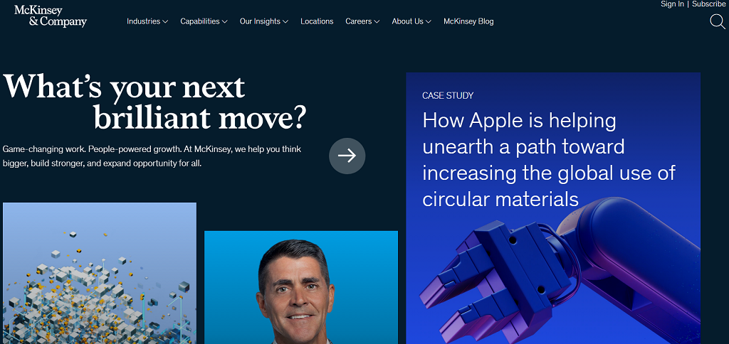
McKinsey’s website is a masterclass in authority-building. It isn’t flashy; instead, it feels like an encyclopedia of insights, filled with research reports, interactive graphics, and trend analysis. The homepage greets you with bold statements supported by numbers, while the navigation leads to deep dives on industries, case studies, and global issues.
Key Features:
- Data-driven articles and reports published regularly.
- Clear industry segmentation, making it easy for visitors to find their sector.
- Minimalist design that highlights content over decoration.
- Consistent calls to action encouraging readers to explore or subscribe.
Takeaway:
By focusing on knowledge-sharing, McKinsey builds trust long before a potential client even considers reaching out. Visitors come for insights and leave with the sense that this firm has the resources to solve large-scale problems.
Boston Consulting Group (BCG)
BCG’s site leans into visual storytelling. The homepage immediately feels dynamic, with bold typography and interactive features that highlight their focus on transformation and innovation. Scrolling through, you’ll encounter case studies packaged almost like short documentaries, balancing sharp design with digestible information.
Key Features:
- Strong visual identity reinforced through photography and motion design.
- Case studies presented with interactive graphics.
- Content grouped by themes such as sustainability, digital, or leadership.
- Prominent links to global insights and reports.
Takeaway:
BCG proves that a corporate consulting site doesn’t have to be dry. Their design choices make complex business transformation stories accessible and engaging, showing how visual presentation can turn information into inspiration.
GrowthLab by Ramit Sethi
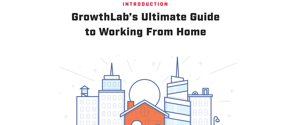
GrowthLab isn’t a corporate giant—it’s built around Ramit Sethi’s personal brand, and that’s exactly what makes it powerful. The site feels like a conversation rather than a lecture. Bold headlines, direct copy, and clear funnels guide visitors into signing up for courses or newsletters. Every element reflects the idea that trust is earned by being upfront and personable.
Key Features:
- Prominent personal branding with photos and direct messaging.
- Lead magnets like free guides and email courses.
- Simple layouts that push attention toward calls to action.
- Stories and testimonials that emphasize transformation.
Takeaway:
GrowthLab shows how personality and expertise can carry a consulting business online. Independent consultants can study this approach and see how personal branding paired with lead capture tools creates a steady pipeline of clients.
Lisa Richey, Business Etiquette Consultant
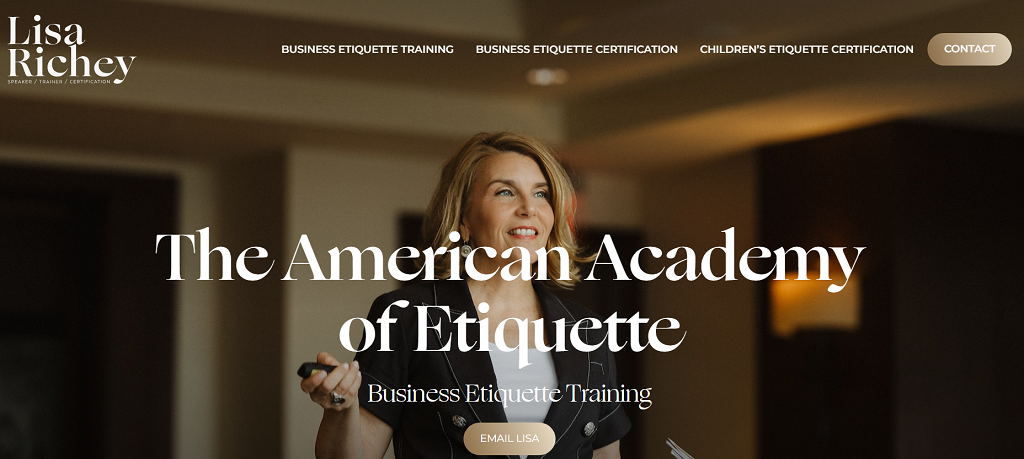
Lisa Richey’s site is an excellent demonstration of how niche consultants can shine. The site is friendly, clear, and rooted in her specialization—etiquette instruction. The homepage introduces the visitor at once as an accessible expert, and the navigation centers on in-use services such as workshops and training programs.
Key Features:
- Clear description of services with easy booking options.
- Testimonials from clients to reinforce credibility.
- Personal photos that highlight trustworthiness and relatability.
- A simple but polished design that keeps focus on the message.
Takeaway:
Her site proves that the best independent consultant websites aren’t necessarily in need of vast contents databases. A solid niche specialization, supplemented with trust indicators and friendly design, is enough to give one consultant the same sense of credibility as that of a bigger company.
Erika Heald Consulting
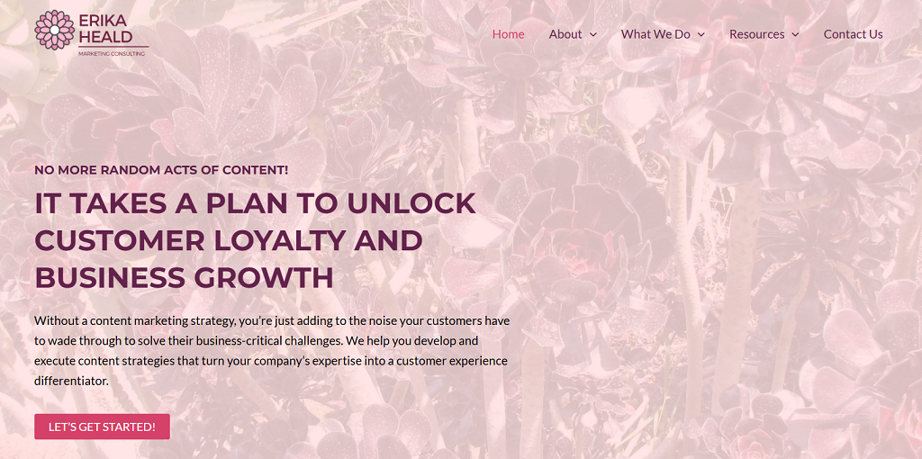
Erika Heald’s site is built around clarity. Instead of overwhelming visitors with jargon, the copy focuses on what she actually does—content strategy, community building, and consulting for businesses that want a sharper voice online. The layout is straightforward, but the simplicity works in her favor.
Key Features:
- Direct messaging that avoids buzzwords.
- Easy navigation that highlights core services.
- Blog posts and resources that display expertise.
- Clear contact paths that invite quick outreach.
Takeaway:
Erika’s website proves that consultants don’t need complexity to stand out. By putting services front and center, and avoiding distractions, she creates a frictionless experience that inspires confidence in potential clients.
Accenture (Technology / IT Consulting Website)
Accenture’s website is a strong benchmark for technology consulting websites because it balances scale with clarity. It offers deep navigation by industries and services, but still keeps “proof” close to the surface: case studies, client stories, and practical insights that signal execution — not just strategy.
Key Features:
– Strong case-study structure (easy to scan, easy to trust)
– Clear segmentation by industry and capability
– High-volume content without losing navigation clarity
– Multiple conversion paths (contact, insights subscriptions, events)
Takeaway:
For IT consulting websites, depth works only when it’s organized. Accenture shows how to publish a lot and still feel structured and credible.
Bain & Company
Bain’s website is polished in a different way from McKinsey or BCG. It feels less like an academic resource and more like a guided journey. Each section is designed to lead you somewhere—whether that’s a case study, an industry insight, or a service explanation. The storytelling approach draws you deeper with every scroll.
Key Features:
- Engaging homepage with client-centric stories.
- Intuitive navigation through industries and solutions.
- Consistent use of photography and design elements to add warmth.
- Calls to action woven naturally into each section.
Takeaway:
Bain shows how large firms can balance authority with accessibility. Instead of relying only on research-heavy content, they mix storytelling with clear service offerings, making the visitor feel like they’re part of the narrative.
Comparison of Key Elements Across Top Consulting Websites
| Website | Type | Standout Feature | Takeaway |
| McKinsey | Global firm | Research insights hub | Authority built through deep, data-driven content |
| BCG | Global firm | Interactive case studies | Visual storytelling makes complex topics engaging |
| GrowthLab | Independent | Lead magnets, courses | Personal brand paired with funnels drives sales |
| Lisa Richey | Niche | Service clarity, testimonials | Focus and approachability build strong trust |
| Erika Heald | Independent | Simple, direct messaging | Clarity and frictionless navigation win confidence |
| Bain & Company | Global firm | Client-centric stories | Guided storytelling turns visitors into prospects |
How to Build a Consulting Website That Stands Out

There’s no shortage of ways to get a site online. A solo consultant might be tempted by DIY website builders: quick, cheap, and with plenty of templates. The problem? Those templates often look the same, and when every competitor uses the same design, you fade into the background. SaaS-based solutions offer more polish but still come with limitations—branding that isn’t truly yours, features you don’t control, and subscription fees that pile up. Larger firms usually move toward custom-built solutions because they need security, scalability, and full ownership. That’s the difference between a site that blends in and one that competes with the best consulting websites.
If you want to build a consulting website that carries weight, start by planning beyond aesthetics. Design matters, but so does the flow: how someone books you, how payments are handled, and how you prove you’re worth hiring.
Practical Steps to Start Today
- Define your niche and audience – Know exactly who you want to reach and tailor your message for them.
- Choose your monetization model – Will you charge hourly, offer packaged services, or build a subscription plan?
- Prioritize branding and payments – Your logo, color scheme, and story should be consistent, while payment options need to be seamless and secure.
- Add engagement tools – Booking calendars, live chat, or gated content help turn casual visitors into paying clients.
Developing online presence is more than that initial setup—it’s iterative. The finest consulting sites grow along with the consultant, tightening up as services expand or audiences shift. What distinguishes the finest aren’t templates—it’s the judicious combination of personal branding, trust markers, and working tools that streamline business both ends.
Scrile Meet: Customizable Development for Consulting Websites
Most consultants outgrow generic templates quickly. You might start with a drag-and-drop builder, but as soon as you need secure payments, branded video sessions, or scalable tech, the cracks show. Scrile Meet fills that gap. It’s not a pre-made platform—it’s a development service that adapts to your goals, giving you the flexibility to create a consulting site that holds its own among the best consulting websites.
With years of experience across varied industries—from corporate advisory firms to adult coaching—Scrile Meet understands how consultants shape and grow their online presence. The service combines this experience with a toolkit built to support consultants who want more than surface-level design.
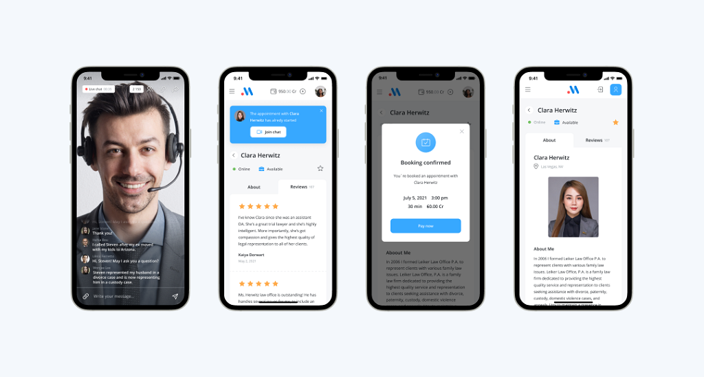
Key benefits include:
- Full white-label branding that puts your name, not someone else’s, front and center.
- Live video consultation features, covering both one-on-one and group sessions.
- Integrated payment systems with direct payouts for smooth transactions.
- Flexible monetization models, from subscriptions and pay-per-minute billing to premium content.
- Scalable, low-latency technology (WebRTC/RTMP) that ensures calls and streams feel seamless.
Behind these features sits a support system—project managers, custom developers, and 24/7 hosting—that ensures the site isn’t just launched but actively maintained. For consultants, that means the freedom to shape a site around your practice rather than squeezing your practice into a rigid template.
Scrile Meet positions itself as a long-term partner, making sure your consulting website can evolve alongside your business.
Conclusion
The best consulting websites all follow the same thread: they make services clear, build trust with proof, and rely on technology that makes the client’s next step effortless. From global names like McKinsey to niche professionals running solo practices, the examples show that size doesn’t matter—clarity and function do. If you’re ready to take your consulting business online or improve what you already have, the next step is simple. Define your goals, think about how you want to engage clients, and contact the Scrile Meet team today to discuss a site built exactly around your needs.
FAQ – Best Consulting Websites (Design, Trust, Booking, Conversion)
The answers people search after they browse consulting website examples: what actually converts, what to show first, and how to turn interest into booked calls.
What makes a consulting website “the best” in 2026?
The best consulting websites do three things fast: they explain what you help with, prove you’re credible, and make the next step obvious (book, message, or explore results).
“Best” is not about fancy animations. It’s about clarity, trust markers, and a frictionless path from curiosity to action—especially on mobile.
What should be “above the fold” on a consulting homepage?
A single, specific promise: who you help + what outcome you deliver. Then one primary call to action (Book a call / Request consultation / See case studies).
If a visitor can’t answer “What do you do?” in 5–10 seconds, they’ll bounce—even if your work is excellent.
What trust elements convert visitors into clients?
The strongest trust stack is simple: a real face + real story, client outcomes (case studies), and social proof (testimonials, logos, reviews) that feels specific rather than generic.
Even one strong case study with numbers beats ten paragraphs of “we deliver value.” Proof removes doubt faster than copy.
Should I show pricing on my consulting website?
You don’t have to publish exact numbers, but you should reduce uncertainty. Many high-performing consulting sites use ranges, package tiers, “starting at” pricing, or clear descriptions of what’s included.
Pricing transparency filters out poor-fit leads and makes good-fit leads more confident when they hit the booking page.
What’s the best booking flow for consulting websites?
The best flow feels like a single path: pick a service → pick a time → pay (optional) → get confirmation + next steps. Every extra click increases drop-offs.
If you want higher-quality calls, add a short intake form before confirmation. Keep it focused: goals, timeline, budget range, and the one key problem to solve.
Are blog posts and “insights hubs” worth it for consultants?
Yes—when you treat content as authority, not filler. One strong article that answers a real client question can bring leads for months and makes your expertise visible before the first call.
The best content strategy is “proof content”: frameworks, examples, common mistakes, and mini case studies that show how you think.
What interactive elements help consulting sites convert better?
The best interactive elements reduce uncertainty: short quizzes, cost calculators, readiness checklists, and downloadable guides that make your value tangible.
Think of them as “micro-wins.” A visitor gets clarity first, then feels comfortable booking.
What are the biggest mistakes on consulting websites?
The classic mistakes: vague positioning (“we help businesses grow”), too many CTAs fighting each other, and no real proof (no outcomes, no testimonials, no clear process).
On the technical side: slow mobile performance, confusing navigation, and forms that feel unsafe or outdated. Trust breaks fast when the experience feels clumsy.
Can consulting websites work for non-traditional niches (creator economy, adult industry, etc.)?
Yes—and in those niches, trust signals matter even more. Clear service boundaries, transparent policies, and professional presentation help clients feel safe booking you.
The goal is the same: credibility + clarity + a simple booking flow. The difference is you may need stronger compliance messaging and carefully chosen payment/communication tools.
Template site vs custom build: when should a consultant go custom?
Templates are fine for early validation. Go custom when your website becomes your product engine: branded client portal, integrated booking + payments, gated content, multi-service packages, or multiple consultants under one brand.
Custom also makes sense when you want full control over data, UX, and roadmap—so your business doesn’t depend on a platform’s limits.

Polina Yan is a Technical Writer and Product Marketing Manager, specializing in helping creators launch personalized content monetization platforms. With over five years of experience writing and promoting content, Polina covers topics such as content monetization, social media strategies, digital marketing, and online business in adult industry. Her work empowers online entrepreneurs and creators to navigate the digital world with confidence and achieve their goals.
BCG’s site really is a visual experience. I show it to clients as a masterclass in storytelling. But I also agree that smaller players can compete by just being clearer. The Lisa Richey example proves that credibility doesn’t need a massive budget.
I appreciate that you mentioned consultants from non-traditional industries too. I work with adult creators on branding and monetization, and it’s rare to see articles acknowledge that niche professionally. Respect for including it.
The “Characteristics of the Best Consulting Websites” section nailed it. I used to think I needed fancy animations, but after switching to a clean, personal layout with my photo and testimonials, my bookings doubled. Simplicity really does sell trust.
Thank you for mentioning that “credibility first, action second” rhythm. I’ve been guilty of writing long case studies without clear next steps. Going to add small CTAs beside each project now.
This line stood out: “A great consulting website doesn’t shout; it guides.” So true. I’ve seen too many pages scream “buy now” instead of calmly leading users through trust-building content. Brilliant writing.
This hit home — “a consultant without a strong online presence might as well be invisible.” I learned that the hard way last year when I relied only on LinkedIn. Finally building my own site now, and this article gave me a clear roadmap.
Loved the breakdown between DIY templates and custom builds. As a web developer, I can confirm — most template-based consulting sites look identical. Scrile Meet sounds interesting; I’ll check it out for a client who needs integrated booking and payments.
I recently rebuilt my site around client transparency and secure payments, and this article perfectly explains why that worked. I wish I had read this before wasting a year on template builders that couldn’t even integrate proper booking tools.
Scrile Meet sounds like the white-label solution we’ve been searching for. We run multiple micro-consulting sites under different brands — owning the platform instead of renting it would be a game changer. Do they support multilingual sites too?